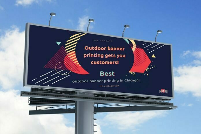
Every marketing department has an aim to capture an audience and persuade them to learn more about their products or services. Arguably, one of the most effective methods of making someone pay attention is with a large billboard placed strategically in a public place.
It’s no surprise that billboard advertising has been a main method of advertising in years, with the first documented lease being in 1867. However, since then, this form of print marketing has become a staple of advertising and has even played a part on the silver screen as a crucial prop in recent blockbuster, Three Billboards Outside Ebbing, Missouri.
The beauty of billboards is that they require little maintenance but can significantly increase your ROI. If you’re not convinced, find out why billboard advertising might be the boost your brand needs…
Table of Contents
Targeting your audience
According to one study, the average Brit is in view of advertisements for around 16 minutes each day. Why not target your consumer during this window of opportunity with a large, quality, well-located billboard in a place with high footfall or traffic?
Having a billboard doesn’t require any additional work to what other advertisements would have and is simple to design and print. Need something effective up and running in a hurry? A billboard is a single page of design, which should save you time when putting together a template that will offer maximum ROI.
The Marketing Rule of 7 theory claims that a consumer must hear or see an advertising message at least seven times before taking action. By placing an outdoor banner in a public place where people will pass every day or a few times a day — like on the way to work or when dropping off and picking up their kids from school — you can help hit this number and potentially increase your brand’s chances of a conversion.
For your overall marketing campaign, a billboard could really drive forward results. So, how do you make sure your billboards are as effective as possible?
The design process
Your billboard won’t work if it’s poorly designed. If your billboard will be placed at the side of a high-speed road, this creates an even greater demand for noticeability. Think strategically about what you want on your billboard — someone driving past at 40mph+ is only going to be able to take in so much. What is your marketing objective? Do you want to sell a specific product? Are you spreading brand awareness? Promoting an event? Determine exactly what you want to achieve from your advertisement and provide only the essential information — like contact number, name of product or date and location of event.
For bigger campaigns that want to catch the attention of everyone, billboards should be your first choice. According to research, people generally only recall 10% of information they hear three days later. However, using a relevant image alongside this information increases retention by 55%. When designing your billboard, try and think of a funny or quirky image that will grab and hold a passer-by’s attention — such as cake brand, Mr Kipling’s, clever and unusual image of a bunny made using only Cherry Bakewell cakes as part of its Easter marketing campaign. Due to the size of a billboard, your images can pack a more powerful punch, so focus on getting the image perfect and then build your design from there.
Utilise bright and bold colours to catch the eye — contrasting colours are reportedly stay in people’s memories for longer, too — and opt for a simple background and large, readable text — Sans Serif is a good shout.
Are you thinking about placing your billboard near a popular road? A driver typically has five to ten seconds to view an ad, which means you need to consider copy length. The more relevant and informative your image is, the less you should need to convey with text — stick to a brief, punchy message of seven words and you should get your marketing message across, no problem.
Think about where your audience will be and whether you could opt for a promotional dibond sign instead. For example, if your products are for 18-21-years-olds, find a site near a university or college. Otherwise, you could reduce your ROI due to not being in sight of the people who are most likely to engage and act on your ad.
When it comes to capturing the attention of people in your area, you must add a personal touch to your advertisement. Include an image of a local landmark to create a sense of familiarity or reference the local traffic in a funny way. Humour generally works in advertising. According to a review of 6,500 ads, the funniest were usually cited as being the most appealing and memorable. What’s more, adopting this personal and familiar approach creates a sense of friendliness, so you’ll also exude a more welcoming brand persona — which will be more encouraging to a potential customer.


